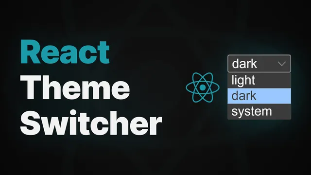
How to create useTheme hook
Feb 14, 2024
•
#react
#typescript
#hooks
•
7 mins read
Have you ever noticed how many websites now let you switch between light and dark mode? Well, in this tutorial, I'll show you how to create your own theme select menu with those values: light, dark, or system's theme preference. We'll handle theme change using a custom hook and React Context. Also, we'll add an ability to store the user's theme preference to localStorage. Let's get started!
Let's start building a React TypeScript project using Vite by running npm create vite . . The following dot means that we’re going to create a project inside the current folder.
npm create vite .Then, install npm dependencies with npm i which is a shorthand for npm install. And, run the local development server
npm i && npm run devFirst, let’s clear the boilerplate.
// App.tsx

function App() {
  return (
    <>
      <h1>Theme</h1>
    </>
  );
}
Then add a theme select menu in a separate file. We’ll create a components folder for better project structure.
To create menu options, we need to create an array with the theme options and map through it.
// components/ThemeSelect.tsx

const ThemeSelect = () => {
  return (
    <select>
      {["light", "dark", "system"].map((option) => (
        <option value={option} key={option}>
          {option}
        </option>
      ))}
    </select>
  );
};

export default ThemeSelect;
Now, let’s import our ThemeSelect component into App component:
// App.tsx

import "./App.css";

import ThemeSelect from "./components/ThemeSelect";

function App() {
  return (
    <>
      <h1>Theme</h1>
      <ThemeSelect />
    </>
  );
}

export default App;
Let's start writing a theme logic. For this simple project, writing the theme logic directly in the App component is sufficient. However, in more complex projects, you may encounter prop drilling issues. To avoid this, we'll use React Context, providing easy access wherever needed.
Let's create a ThemeContext.tsx file inside contexts folder. I suggest you to group all the files in your project for better structure and readability. For example, place all your contexts inside context folder, hooks into hooks folder, components inside components, etc.
The first step is to create a context using the createContext hook.
// contexts/ThemeContext.tsx

const ThemeContext = createContext();
We need to pass an initial state, let's define it above. Our initialState will be an object with the current theme and changeTheme function. Also, in a separate constant we’ll define a DEFAULT_THEME as system’s preference theme.
// contexts/ThemeContext.tsx

const DEFAULT_THEME = "system";

const initialState = {
  theme: DEFAULT_THEME,
  changeTheme: () => {},
};
Let's define type definitions. First, we need to define themeOptions as an array of strings. Then, define a Theme type with indexed access type, so the Theme type equals to themeOptions array values. And, InitialState type object, where theme is type of Theme, and changeTheme is a function that accepts a selectedTheme in type of Theme and returns nothing (void).
// contexts/ThemeContext.tsx

const themeOptions = ["light", "dark", "system"];

type Theme = (typeof themeOptions)[number];
type InitialState = {
  theme: Theme;
  changeTheme: (selectedTheme: Theme) => void;
};

const DEFAULT_THEME = "system";

const initialState = {
  theme: DEFAULT_THEME,
  changeTheme: () => {},
};
The second step is to define and export a context provider component in order to give an access to the latest context to all our components.
// contexts/ThemeContext.tsx

// ... other code...

export const ThemeContextProvider = ({ children }: { children: ReactNode }) => {
  const [theme, setTheme] = useState<Theme>(DEFAULT_THEME);

  const value = {
    theme,
    changeTheme: (selectedTheme: Theme) => {
      setTheme(selectedTheme);
    },
  };

  return <ThemeContext.Provider value={value}>{children}</ThemeContext.Provider>;
};
We’ll store a theme with useState hook. When we need to update theme, we’ll use setTheme function that will trigger all child components that are using this context to re-render.
Also, In the ThemeContext.Provider, the value prop is required. It has the exact structure as the initialState object, but the theme key equals to the theme state which is the latest theme value in our app. It helps to share the current theme and the way to change it with all the components. Overall, this makes sure that every part of your app knows about the latest theme, making it easy to have a consistent look and feel.
Finally, wrap all our components inside main.tsx file.
import React from "react";
import ReactDOM from "react-dom/client";
import App from "./App.tsx";
import "./index.css";
import { ThemeContextProvider } from "./contexts/ThemeContext.tsx";

ReactDOM.createRoot(document.getElementById("root")!).render(
  <React.StrictMode>
    <ThemeContextProvider>
      <App />
    </ThemeContextProvider>
  </React.StrictMode>
);
The last step is to create a useTheme hook that will help to use our context inside components:
// hooks/useTheme.tsx
import { useContext } from "react";
import { ThemeContext } from "../contexts/ThemeContext";

export const useTheme = () => {
  const context = useContext(ThemeContext);

  return context;
};

export default useTheme;
Now we can import that hook into ThemeSelect component. Use destructuring to get theme and changeTheme function. Use defaultValue attribute and put theme here. We’ll also add onChange function that will execute changeTheme with selectedTheme passed in.
// components/ThemeSelect.tsx

import { Theme } from "../contexts/ThemeContext";
import useTheme from "../hooks/useTheme";

const ThemeSelect = () => {
  const { theme, changeTheme } = useTheme();

  return (
    <select
      defaultValue={theme}
      onChange={(e) => {
        const selectedTheme = e.target.value as Theme;
        changeTheme(selectedTheme);
      }}
    >
      {["light", "dark", "system"].map((option) => (
        <option value={option} key={option}>
          {option}
        </option>
      ))}
    </select>
  );
};

export default ThemeSelect;
Also, let’s make a tiny adjustment here, and change our options array to themeOptions array from ThemeContext.tsx file:
// components/ThemeSelect.tsx

// ...
{themeOptions.map((option) => (
// ...
Now, let’s open React Developer Tools, try to change a theme and check if the theme state changes indeed.
As you see, it works.
The theme logic is ready. However, we’re not changing any CSS according to theme changes yet. Let’s add some styles inside index.css file:
body {
  margin: 0;
  display: flex;
  place-items: center;
  min-width: 320px;
  min-height: 100vh;

  color-scheme: light;
  background-color: rgba(255, 255, 255, 0.87);
  color: #242424;
}

body.dark {
  color-scheme: dark;
  color: rgba(255, 255, 255, 0.87);
  background-color: #242424;
}
We’ve added the .dark class that is being toggled on the body element to enable dark mode. A color-scheme property will toggle dark mode for interactive elements, such as our <select> element.
Now, we need to toggle that class each time when theme state changes. We can achieve it with a useEffect hook. Let’s go back to our ThemeContext.tsx file and place the useEffect inside the context provider. Put theme in the dependencies array.
// contexts/ThemeContext.tsx

// ...
export const ThemeContextProvider = ({ children }: { children: ReactNode }) => {
  const [theme, setTheme] = useState(DEFAULT_THEME);

  useEffect(() => {

  }, [theme]);

  const value = {
    theme,
    changeTheme: (selectedTheme: Theme) => {
      setTheme(selectedTheme);
    },
  };

  return <ThemeContext.Provider value={value}>{children}</ThemeContext.Provider>;
};
/// ...
Notice that this is just my approach for changing styles for the dark mode. An alternative way is that instead of toggling the dark class, you can import useTheme hook inside your component and change styles conditionally with the theme state extracted from the hook.
Now, let’s build the logic inside useEffect:
- Define darkModePreference variable. It is used to detect if the user's operating system is set to dark mode.
- Then, we check if theme is system. If so, check if system’s theme is dark. If true, add ‘dark’ class to the body element. Otherwise, we remove this class.
- Then, we check if theme is dark and add dark class to body
- Last, we check if theme is light and remove our class from the body element
// contexts/ThemeContext.tsx

/// ...

useEffect(() => {
	const darkModePreference = window.matchMedia("(prefers-color-scheme: dark)");

  if (theme === "system") {
    darkModePreference.matches
      ? document.body.classList.add("dark")
      : document.body.classList.remove("dark");
  }

  if (theme === "dark") {
    document.body.classList.add("dark");
  }

  if (theme === "light") {
    document.body.classList.remove("dark");
    }
}, [theme]);

// ...
Try to change theme and see if it works…
Also, add a listener to listen to system’s theme changes. Don’t forget to remove event listener when component unmounts using return function.
// contexts/ThemeContext.tsx

// ...

useEffect(() => {
  const darkModePreference = window.matchMedia("(prefers-color-scheme: dark)");

  if (theme === "system") {
    darkModePreference.matches
      ? document.body.classList.add("dark")
      : document.body.classList.remove("dark");

    const handleSystemThemeChange = (e: MediaQueryListEvent) => {
      e.matches
        ? document.body.classList.add("dark")
        : document.body.classList.remove("dark");
    };

    darkModePreference.addEventListener("change", handleSystemThemeChange);

    return () => {
      darkModePreference.removeEventListener("change", handleSystemThemeChange);
    };
  }

  if (theme === "dark") {
    document.body.classList.add("dark");
  }

  if (theme === "light") {
    document.body.classList.remove("dark");
  }
}, [theme]);

// ...
Now, let’s choose ‘system’ theme and change a theme in OS settings. I’m on Windows.
Everything works as expected!
The last important thing to notice: if you choose any theme and refresh the page, it restores to the default theme. To make the browser remember the user's theme preference, we'll save the selected theme to localStorage and read it from localStorage every time the user opens the app, ensuring a seamless experience.
First, let’s define a key in a variable that we’ll use to access the storage. This helps us to avoid any misspelling in the future.
// contexts/ThemeContext.tsx

// ...

const STORAGE_KEY = "theme";
Let’s handle saving the selected theme.
// contexts/ThemeContext.tsx

// ...

const value = {
  theme,
  changeTheme: (selectedTheme: Theme) => {
    try {
      localStorage.setItem(STORAGE_KEY, selectedTheme);
    } catch (error) {
      console.warn("Error while trying to access localStorage: ", error);
    }

    setTheme(selectedTheme);
  },
};

// ...
Last, we need to read the user’s theme preference when the user opens the app.
// contexts/ThemeContext.tsx

// ...

const [theme, setTheme] = useState<Theme>(() => {
  try {
    const savedTheme = localStorage.getItem(STORAGE_KEY) as Theme;
    if (savedTheme) return savedTheme;
  } catch (error) {
    console.warn("Error while trying to access localStorage: ", error);
  }

  return DEFAULT_THEME;
});

// ...
Let’s choose a different theme and try to update the page. As you see, the state is initialized with the saved theme.
That’s all.
We've successfully created a dynamic theme switcher in React using the useTheme hook and React Context. By leveraging local storage to persist user preferences, our application ensures a seamless experience across sessions. This tutorial provides a solid foundation for building more complex theming systems and highlights the power of React's context API in managing shared state across components.
Happy coding!